What Net Promoter Score Can Teach Us About Building Better Surveys
And what it can't...
Before diving into the post, I just wanted to quickly say I’m incredibly flattered at the interest in this project. Thank you for your interest and a special thank you to those of you who dropped me a note, even if we haven’t spoken in years. I really appreciate it.
For those unfamiliar with it, Net Promoter Score (NPS) is a very popular question used to measure what people think about a particular product, brand, or organization.
At its core, it asks:
On a scale of 0-10, how likely are you to recommend XXX to a friend or family member?
The history behind its development is actually pretty interesting and I think gets a lot of things right. But like many things, people tend not to read the original article and instead jump to Google to figure out how to calculate it and benchmark their organization. So I’m going to focus more on the motivation behind the score. I’ll provide a summary of the critiques as well because I think they’re instructive more generally of what NOT to do.
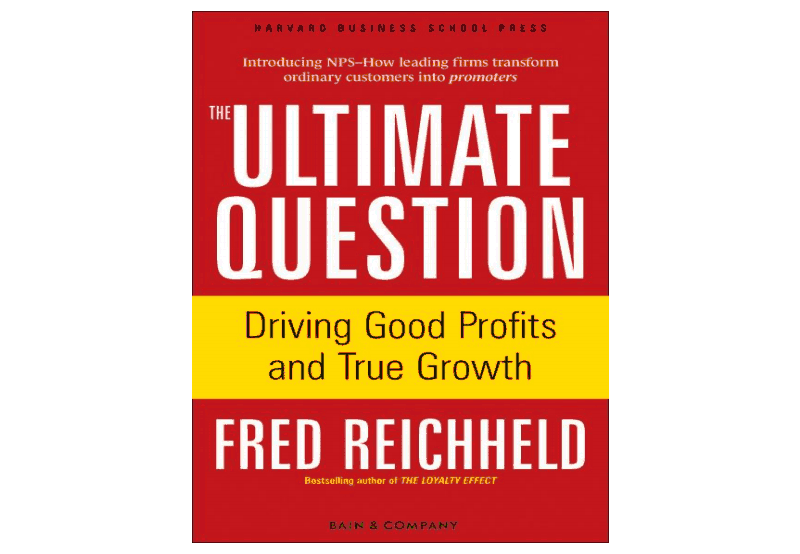
NPS’s popularity was launched by a much-discussed article in Harvard Business Review (HBR) as well as some best-selling business books written by Fred Reichheld from Bain & Company, a consultancy (full disclosure, I worked for a non-profit spinoff of Bain.) It helps to be a big wig at a very large management consulting firm if you’re trying to get your idea widely-adopted. The claims by Reichheld were pretty remarkable. Here’s a summary from his 2003 HBR article:
“Companies spend lots of time and money on complex tools to assess customer satisfaction. But they’re measuring the wrong thing. The best predictor of top-line growth can usually be captured in a single survey question: Would you recommend this company to a friend?”1
The business book cover was pretty bombastic as well. It screams “I stand out on the Hudson News display!” Buy me!
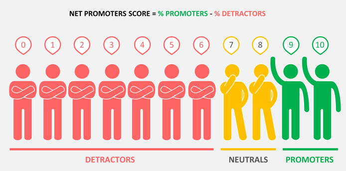
For background, that question is asked on a 0-10 scale, with just the poles labeled with 10 being “extremely likely” and 0 being “not at all likely.” Sometimes people will add 5 as “neutral” for a middle reference point, but most of the time it’s just presented as the poles. This 11 point scale is then transformed into what’s essentially 3 categories with values of -1, 0, 1.
Specifically:
Scores of 0-6 are categorized as -1
Scorers of 7 and 8 are categorized as 0
Scores of 9 and 10 are categorized as 1
You then sum these categories and divide the sum by the number of survey takers. Because people hate decimals, you multiply it by 100 to make it a round number.
Before diving into the critiques, I think it’s worth looking back at the origin of NPS. The motivating story in the original article was about Enterprise Rent-a-Car, which was using a very short customer satisfaction survey across its thousands of branches in order to understand which branches were high and low performing. Instead of the much longer consumer satisfaction surveys, commonly 10+ questions, this one was just two questions:
1) A question on the quality of their rental experience
2) A question on how likely they were to rent a car again.
Enterprise also focused on extreme values versus just average scores when analyzing the data. They ranked branches on the percent of customers giving only the highest ratings.
Reichheld’s self-described rationale for developing NPS was to take Enterprise’s success and make it something more general. He wanted to make a simple metric that could be used to compare companies within an industry, not just branches within a single company. His approach was to start with a relatively large set of customer satisfaction questions and narrow it down to a small set based on which best predicted consumer behavior. Specifically, he was looking at what questions best predicted consumes actually making a referral to a new customer.2
What he found in his survey was the strongest correlation to actual referrals was the question on a person’s likelihood of recommending the product or service. Reichheld then did something that many people don't do with their data; he actually looked to see which values on this scale best correlated with referral behavior. It turns out this result was primarily driven by the people responding high on the scale, so that is how he built the aforementioned three categories.
For the statistics nerds out there, the most controversial part of NPS is the transformation of the 11-point question to the 3 categories of “detractor” (0-6), “neutral” (7-8), and “promoter” (9-10). Mathematically, this is problematic because you lose a lot of information — a respondent who provides a 6 on this scale versus a 0 seems like they’re telling you different things. Also, by simply subtracting detractors from promoters, you’re making an assumption that detractors should have equal weight as promoters.3 That may be true in some cases, but it’s not obvious that this assumption would hold across all industries in the same way. For example, detractors may matter more for businesses where there’s a reliance on reviews, like restaurants, more than a commodity business that’s competing more on price.
Given these criticisms (and there are many, many more), you might ask yourself why Reichheld did some funky math and come up with categories? The rationale was interpretability by staff. Specifically, Reichheld writes:
“... frontline managers … could relate to the goal of increasing the number of promoters and reducing the number of detractors more readily than increasing the mean of their satisfaction index by one standard deviation.”
It’s a bit ironic in that the score itself is not very interpretable - it’s not super clear what a 50 versus a 55 is in part because there’s a lot of different ways mathematically to get there. But the general idea of increasing the number of promoters and decreasing the number of detractors is tangible and easy to explain, even if you don't understand the math. If you are trying to create metrics that don’t require a ton of statistics or training, there’s definitely an argument that making something that suboptimal from a statistical standpoint in favor of making it more accessible. And once again, the impulse to create measures that are easy to grasp is definitely the right one.
It’s also worth thinking about why NPS has staying power despite so much conversation about its flaws.4 I believe its stickiness stems from both internal and external pressures from benchmarking. Stakeholders, especially investors, want to know where a company stands relative to the competition. Even if NPS isn’t a perfect measure, it’s something that competitors are using and there’s no easy substitute. It’s hard to give up because there’s no widely adopted other way to compare customer satisfaction across organizations.
Companies also want to be able to benchmark their current performance against past measures. For this reason, switching surveys is pretty costly internally because it means you won’t be able to look back on past performance and compare apples-to-apples. It’s easy for ivory tower observers to comment on NPS’s inappropriateness without proposing a solution that addresses these two issues.
So in sum, I think the development process of NPS was relatively on the mark. We should be trying to reduce the size of surveys into bite-sized chunks. We should be testing to see if the survey questions we’re asking actually map to behaviors we care about. Rather than assume an average is always the right metric just because it’s easy to run a significance test, it’s worth looking at the data and considering other metrics that may map better to our understanding of the process. Where NPS fell short was in the details of the math and implementation.5
So what should you do? If you’ve already adopted NPS, I think the right thing to do is to keep asking the question but ditch the math at least for internal purposes. That way you can keep calculating NPS for whatever stakeholders demand it. You can also easily take your old NPS surveys and use different metrics with the scores. If both extremes matter more, you can decompose the score into the percent of extremely low scores and extremely high scores. If averages don’t make sense, you can use other metrics like the top or bottom quartile. You can easily set your own thresholds for these, ideally based on behavioral data like conversions (if you have it) just like Reichheld did.
If you haven’t adopted NPS, it’s worth considering the importance of external pressures here. If your funders (or potential funders) are going to ask for it, then it’s probably worth asking the question as part of your customer experience data collection efforts. Otherwise, you might consider shorter scales that are easier to combine with other questions. You may even take the approach Reichheld did and start with a longer set of questions that you try to pair down through tools like factor analysis.
https://hbr.org/2003/12/the-one-number-you-need-to-grow
From a statistics perspective, you would want to do something like an exploratory factor analysis of those questions to reduce the question set. Then you’d look to see how those factors correlate with an outcome. Conceptually, Reichheld’s approach is similar to this.
https://medium.com/@colin.fraser/at-least-two-reasons-why-you-probably-shouldnt-use-the-net-promoter-score-4e7c9da07c4a
It also is an especially terrible question to take mobile devices. I’ll talk about this in a lot of detail in my next post.


Thanks for sharing, Jacob. It was super-interesting to learn how you think about this. Now I will do the academic thing and critique NPS' simplicity :)
If I could fix one thing it would be to add a variance component. A "focused 7" (all 7s) means something very different than a "broad 7" (half 10s, half 4s) and has very different implications for a manager trying to improve it. I can see how means are useful for understanding "between" variance (good Enterprise branches, bad Enterprise branches), but they are not so useful for a branch manager trying to improve their performance.