Mobile-First Data Collection is a Must
Most surveys and forms are NOT designed for nor tested on phones. That's a problem when most users are on their phones all the time.
Not so surprising fact #1: Most people use their phones to access the internet and this is a growing trend.1 You’re probably reading this on your phone right now.
Not so surprising fact #2: Most people I know design data collection experiences on a laptop or desktop.
Taken together, these statements lead to a serious useability challenge:
We design data collection tools on large screens with keyboards and mice.
Most users enter data on small touchscreens with autocomplete.
Tools often claim they’re “mobile-friendly” or “mobile optimized”. As I’ll show below, that’s not enough. Mobile-first design2 means making choices that privilege experiences that work on phones over larger devices. Neglect this and you’re going to frustrate your users and get worse quality data.
Understandably, no one wants to design a survey or form on their phone. But if you’re using a 13”+ screen to build a survey, it’s too easy to make choices that work fine on a laptop but cause issues on phones. Certain question formats require precise tapping and that just doesn’t work on phone screens. Frustrated users won’t necessarily correct mistakes. They may satisfice or even just drop off.
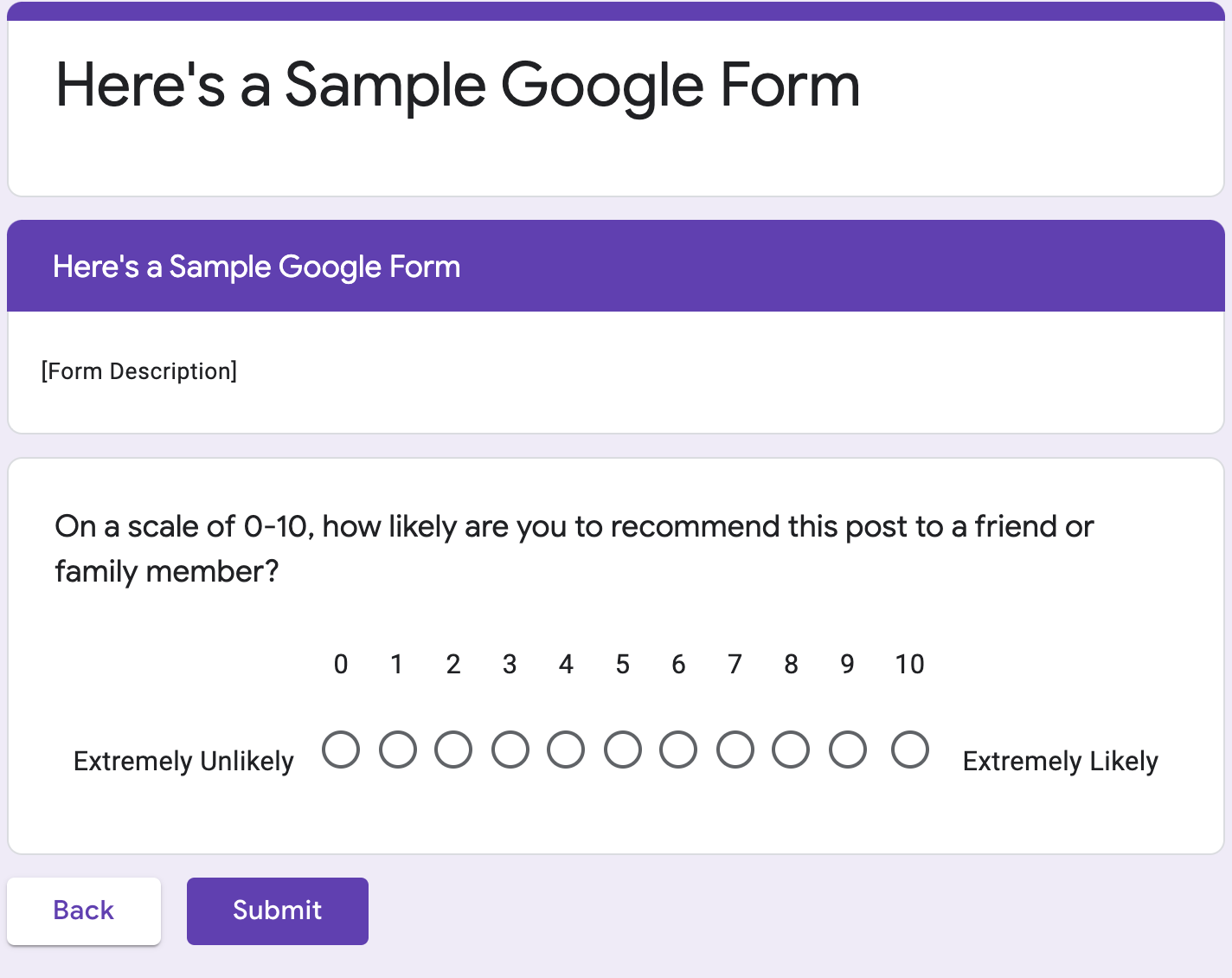
To illustrate a few issues, below is a Google Form using all default settings for a Net Promoter Score (NPS) type question. NPS is a pretty standard 0-10 point question on how likely you are to recommend a product or service to someone else. It’s usually asked after a customer service interaction, so it seems like something you’d want to render well on mobile. I’m using Google Forms because it’s popular, but this exercise could easily be replicated on almost any other survey product I’ve come across.
As you can see, it’s pretty easy to misclick a button. For most questions, this would just add some statistical noise (not great). For NPS, it’s a bigger deal because of the cutoffs of 6 and 9 to calculate the score.3 Make a mistake on either side and you’re going to be adding a lot of variability to your score.
This is not a uniquely Google problem. Here’s SurveyMonkey’s templated NPS question on mobile, which also uses a horizontal format.

So what happens if we make these vertical rather than horizontal questions?

The desktop version is acceptable but not great. The answer choices just barely fit on my screen. In fact, I actually have to do a bit of scrolling to get the full set.
The mobile version is way better than the horizontal scale. I can easily click on the button that corresponds to the right number. I can’t fit the entire scale on the page without scrolling down, but that’s OK. If I only had two options, I’d choose this one since it actually works on mobile, where people are very used to scrolling.
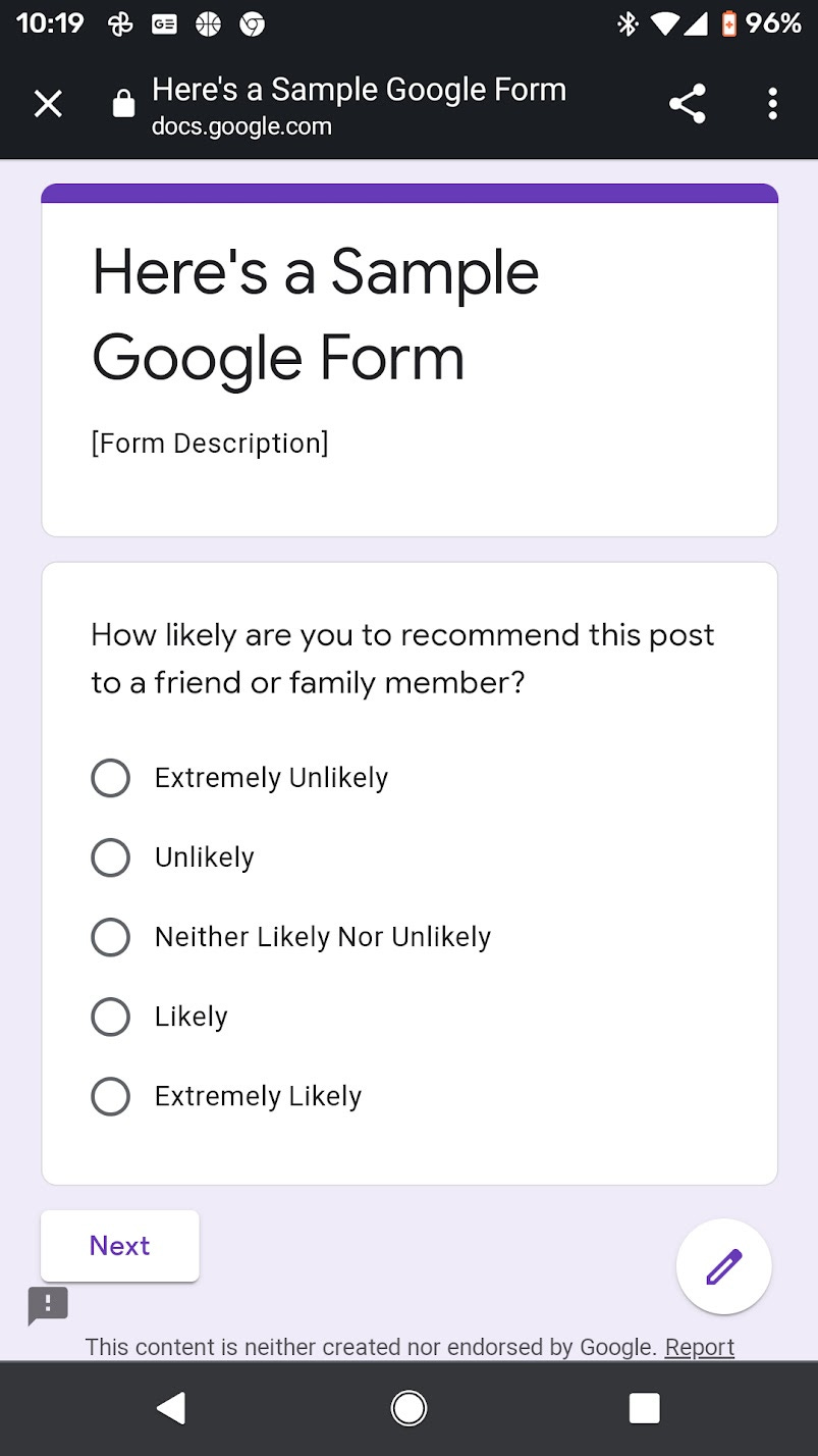
So what happens with a shorter scale? Let’s try a 5 point scale.
That actually works pretty well on both desktop and a phone. It turns out, questions with 11 answer choices don’t work so well on a phone screen. I would use 7 choices max to be safe.
I’d emphasize that this is a very conservative test for readability and clickability. Google Forms uses small fonts. If I were building this in another product, I’d almost certainly increase the font size.
Keep in mind that my Google Pixel 2 has a 5” screen, which is fairly large by phone standards. For reference, an iPhone 8 and iPhone SE have a 4.7” screen, meaning they’re roughly 13% smaller in terms of screen real estate.4
The bottom line is when I build surveys and forms, I test them on multiple browsers and devices. And the first test I do is on Android and iPhones. If it doesn’t work, then it’s back to the drawing board immediately.
The range of devices I test on depends on who is in the audience. My bias is to design for older devices, which tend to have smaller screens.5 In general, if something renders well on a smaller screen, it’ll look fine on a larger one.
You have to account for phone lifespans, which have also been increasing to an average of almost 2 years.6 Older flagship phones are also very popular purchases. According to one market research firm, in 2019 the iPhone 8 was the 3rd most popular smartphone sold in North American and even outsold Apple’s new flagship phone that year.7 That means even in 2021, there’s a good chance your users will be using a model that’s several generations old with a much smaller screen than you might have if you upgraded recently.
Companies have made some progress in helping data collection designers here. Qualtrics and SurveyMonkey, for example, have mobile “previews” that emulate a phone screen. But those are partial solutions at best that will catch egregiously bad choices. Trust me, I’ve measured.

Nothing replaces actual testing on a mobile device, in part because of nuances like screen size, operating system, and browser. Simulators tend to lag on these changes or won’t necessarily be geared for your particular audience.
In sum, your data collection tools need to work well on mobile. You should be testing these tools on mobile devices, ideally multiple operating systems and multiple screen sizes. It’s a great excuse to break out your old phones that are collecting dust in drawers. Or to ask your friends for their old phones for testing. Your users will thank you.
And in case you were wondering, I tested this post on my phone. Substack also (weirdly) doesn’t have good mobile preview or testing tools.
https://www.pewresearch.org/internet/2019/06/13/mobile-technology-and-home-broadband-2019/
The term “Mobile-First Design” comes from the UX field. It’s pretty intuitive, but if you want more detail in UX jargon, see https://www.justinmind.com/blog/complete-guide-to-mobile-first-design/
See my prior post for more detail on NPS as a question: https://databetter.substack.com/p/what-net-promoter-score-can-teach
Since screens are measured in diagonals, small changes in the size of the diagonals translate into larger changes in area. All of these phones have the same 16:9 aspect ratio, so that makes the math easier.
There’s a longstanding trend of cell phone screens getting larger and larger. https://www.statista.com/statistics/1042669/us-smartphone-sales-by-display-size/
https://www.cnbc.com/2019/05/17/smartphone-users-are-waiting-longer-before-upgrading-heres-why.html
https://www.counterpointresearch.com/iphone-11-second-best-selling-phone-2019-less-four-months/ https://www.counterpointresearch.com/iphone-11-second-best-selling-phone-2019-less-four-months/


Brilliant and practical advice as always, Jacob! NPS 10!